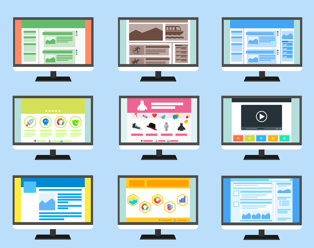
Bootstrap is a free front-end framework for faster and easier web development. Bootstrap includes HTML and CSS based design templates for typography, forms, buttons, tables, navigation, modals, image carousels and many other, as well as optional JavaScript plugins. Bootstrap also gives you the ability to easily create responsive designs.
Download Bootstrap
If you want to download and host Bootstrap yourself, go to getbootstrap.com, and follow the instructions there.
Bootstrap CDN If you don’t want to download and host Bootstrap yourself, you can include it from a CDN (Content Delivery Network). MaxCDN provides CDN support for Bootstrap’s CSS and JavaScript. You must also include jQuery:
<link rel="stylesheet" href="https://maxcdn.bootstrapcdn.com/bootstrap/3.3.7/css/bootstrap.min.css" />
1.A container
2.Rows
3.Columns
Bootstrap’s grid system needs a container to hold rows and columns.A container is a simple div element with a class of .container. The container is used to provide a proper width for the layout, acting as a wrapper for the content.You can choose a fluid container if you are not fond of a fixed layout.
A row acts like a wrapper around the columns. The row nullifies the padding set by the container element by using a negative margin value of -15px on both the left and right sides.A row spans from the left edge to the right edge of the container element. It is created by adding the class.A row to a block level element inside the container.
Bootstrap uses different column class prefixes for different sized devices. In the above demo, I used the class .col-xs-12 to create a single column that spans across 12 virtual Bootstrap columns. Hence, this column’s width will be the width of the row. In the above demo, you will also see the 15px padding reappear to push the element away from the container. This is because every column in Bootstrap has a padding of 15px. You must be wondering why I used the class prefix that belonged to extra smaller devices, which is .col-xs-12.This way, we maintain the limit of 12 virtual Bootstrap columns for a single row.
<div class="row">
  <div class="col-sm-4">.col-sm-4</div>
  <div class="col-sm-4">.col-sm-4</div>
  <div class="col-sm-4">.col-sm-4</div>
</div>
This is for three equal columns.then,
To apply grid for multiple devices simultaneously, include them together in the classes.
<div class="container-fluid">
    <h1>Grid Responsive using bootstrap :</h1>
    <hr>
    <div class="row" >
        <div class="col-md-3 col-sm-6 col-xs-12" style="background-color:red" >
            <p>1st grid to display</p>
        </div>
        <div class="col-md-3 col-sm-6 col-xs-12"  style="background-color:blue">
            <p>2nd grid to display</p>
        </div>
        <div class="col-md-3 col-sm-6 col-xs-12" style="background-color:grey">
            <p>3rd grid to display</p>
        </div>
        <div class="col-md-3 col-sm-6 col-xs-12" style="background-color:green" >
            <p>4th grid to display</p>
        </div>
    </div>
</div>
For any query contact Clofus Innovations.
Just leave your email and our support team will help you